_edited.jpg)
A New Look, Rooted in Our History

The Rocky Flats Downwinders logo has evolved, but the story behind it remains the same.
Rocky Flats Downwinders has a new visual identity.
But before introducing it, we want to recognize where it began.
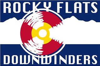
When Rocky Flats Downwinders was being established around 2015, Colorado artist and filmmaker Jeff Gipe created our original logo. The design drew inspiration from the Colorado state flag and incorporated the international radiation symbol into something immediately connected to this place.
It was a remarkably fitting idea for an organization created by people who were beginning to look differently at the Colorado landscape they had known for years.
The idea hidden inside the original logo
The Colorado flag provided a natural starting point: blue skies, white snow, red earth and the gold of Colorado's abundant sunshine.
But within the RFD logo, those familiar elements told another story.
The radiation trefoil was incorporated into the Colorado-inspired circle. Its distressed treatment made portions of the symbol appear almost to disappear into the design.
That idea has become even more meaningful to us over time.
Radiation is invisible.
Someone could grow up near Rocky Flats, see the mountains every day and never fully understand what was happening at the nuclear weapons plant nearby. That experience is part of the reason Rocky Flats Downwinders exists.
Our original logo managed to place those two realities in the same image: the Colorado we love and a history that was much harder to see.
Evolving the mark
As we began redesigning the Rocky Flats Downwinders website, we didn't want to abandon that idea.
We wanted to build upon it.
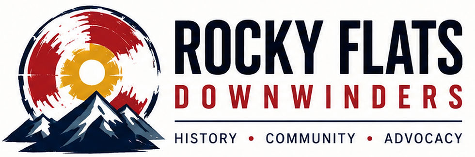
The new mark retains the visual DNA of Jeff Gipe's original design—the Colorado influence, the radiation imagery, the red, gold, white and deep blue, and the distressed character that keeps the symbol from feeling too polished or corporate.
But we've brought the Colorado landscape more prominently into the image.
The mountains now sit directly in front of the circular sun/radiation symbol. They ground the identity geographically and make an important statement: This happened here.
Rocky Flats was not somewhere distant from Colorado communities. It operated beside a growing metropolitan area. People lived nearby, attended schools nearby, worked nearby and raised families in the communities surrounding it.
That connection between place and history is central to the work we do.

Sunshine, mountains—and something else
There's another layer to the new mark that we didn't necessarily set out to create.
The gold center still evokes Colorado sunshine—the beauty, opportunity and outdoor life that draw people to this place.
Behind the mountains, however, that sun becomes something else.
The red and white forms reveal the radiation symbol.
The white portions are particularly important to us. They can almost disappear against the background even though they are still present.
The invisible danger is part of the image. You simply have to know what you're looking at.
And when the entire mark is viewed together, the circle can even resemble an eye looking across the mountains.
We have come to see that as another fitting symbol for RFD: looking at this history with our eyes open.
Once you know the history, you see the landscape differently.
That may be the simplest explanation of what our new identity means.
At first you see the Colorado sunshine.
Then the mountains.
Then you notice the radiation symbol.
Nothing about the landscape changed.
What you know about it did.
That experience mirrors what brought many people to Rocky Flats Downwinders in the first place. They discovered something about the history of the place where they lived or grew up, and suddenly familiar geography carried a different meaning.
Our new identity is meant to carry that story forward while honoring the idea that started it.
The logo has evolved.
Our work has evolved.
But the reason for keeping this history visible hasn't.
The story didn't end when the plant closed.


Comments